Thursday, 22 December 2011

Available Programs for my Production

I researched different programs available for each stage of my production progress, finding a small list for each of these as shown below, I will be researching the Pro's and Cons of each software, before deciding on one from each section to work with on my final piece.

Spriting Programs –

Drawing and Editing Programs –
Easy Paint Tool Sai - http://sai.detstwo.com/sai/

Animating Software -

Game Making Software –

Video Editing programs –


Wednesday, 21 December 2011

Software Research Proposal

The Software I use during my production will be an important factor of creating my final products, so finding the right software to make these in will be something I will have to research.
As far as my final production goes, I will be making the box (packaging) for a new game (For PC, as decided by my survey monkey) along with two trailers (One showing game play and reactions, the other showing an animation and a small amount of game play, much like the Okami-den trailer) and a magazine advertisement for this game.
To do this I will need to use various programs, to get the most professional looking final product possible. When creating these pieces, I will need to find a game making software (To show footage, during one of my TV advertisements, sticking to conventions), a Video editing program will be needed to piece together both of my TV Advertisements and a type of image editing program, such as photoshop for the editing together of these pieces. I will also need a spriting program, to create sprited characters for my game.
Over the next few weeks, I will be researching various Game Making, Animation and Spriting programs, to determine which I think is most suitable for my final piece. Photoshop and Final Cut Pro will be used for the creation of my packaging and advertisement as I have used these programs previously  in AS and have experience with both of them.  

Tuesday, 13 December 2011

Useful Articles - Piracy in the video game industry


I found three more articles relevant to the industry I will be producing for, these, showing conflicting views on the market in terms of piracy.

The first article, found on DigitalSpy, compares the two below articles which argue whether PC game piracy is in decline or on the rise.

The BBC, reporting on the rise of piracy and the PCGA reporting that game piracy is infact in decline. The issue of PC game piracy is a big one in the industry, but I believe that with Digital Distribution and the ability to download 'demo's' of games, dominating the market at current, it will definitely fall in the future.

I think with the current economical climate, and with the 'at home', games and dvd's market doing so well, keeping an eye on the gaming industry and the introduction of new articles like this would be very useful thing for me to do and would greatly help both my understanding of the industry and may help influence my production.

Saturday, 10 December 2011

Useful Article - New Technology


Whilst researching for my pre production, I stumbled across this article on Statesman.com, confirming my beliefs that Digital Distribution and handheld apps in the gaming industry are helping open doors for Independent game developers. 

The thing I found particularly interesting about this article is the statistics included in it, such as "11.2 million digital downloads of PC games were purchased online, according to technology research firm NPD Group. That's compared with 8.2 million "physical units purchased at retail" and this quote on the abundance of physical games "I think (packaged products) will always exist, until every last person is connected to the Internet," 

I think this article enforces my idea of having my game as a packaged, indie game, as well as advertising it to be offered through digital distribution. 

Wednesday, 23 November 2011

Designing my Characters

When designing my characters, I had to think carefully about the target audience my game was intended for. From the results of my questionaire, I had already decided that I wanted my game to be aimed at a neutral gender audience between the ages of 12 and 24 (Young gamers along with older ones that may appreciate the retro feel i'm going for) I wanted however, to keep my game to a 3+ or 7+ age rating, this was because that way I would be reaching the largest audience.

With these things in mind and with my Synopsis, I began sketching out character designs and concepts for both Wren and ZED900. I wanted both these characters to be quirky in some way and wanted Wren, the protagonist, to take the role of an unlikely hero, much like Mario and Donkey Kong, as earlier discussed.

Below is my design for Wren. I chose to give him a ginger afro, freckles and glasses to fit in with the unlikely hero theme, but also with the nerd persona I was looking to create.


(Click to see in full view)

I also gave Wren some other features such as specific items of clothing and books, this should help to enforce his character and make him more recognisable.

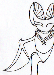
When it came to designing ZED900, it was a little more tricky for me to work with. I wanted ZED900 to be the comedy relief of my game, making him quirky and funny, but also look like an AI Bat, like I had originally planned.
After several sketches and design ideas, I finally came up with a design I liked. Several of my design sketches are below, along with my final Design, which I drew onto A3.


I am very happy with both the designs for these characters, I feel they work well with the idea I wanted to portray with my game, but they also look like unlikely heroes and are not characters you'd expect. I will now be looking into spriting and digitally drawing them, ready for my games trailers and cover.

Tuesday, 22 November 2011

New Technology and Impact on my Productions

When it comes to New technology, it will play a big part in the creation of my final piece. Not only has new technology dramatically effected the video game industry in general, it has also affected the way that advertisements, TV spots and game covers are presented.

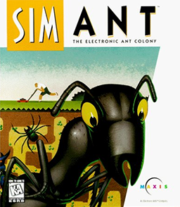
Firstly, a comparison of how new technology has improved the look of video game packaging. Maxis, now owned by EA, and popular for it's simulation games created the renowned  'SimAnt' game in 1997. Technology was not as advanced then, therefore the packaging looks nothing like what their new games packaging looks like now. Spore, released 10 years later, in 2007 looks very different to this. Below is a comparison of the packaging for the two.


The quality of magazine advertisements has also improved significantly since this time, another comparison of two Maxis advertisements in the last 10 years is shown below.


The quality of magazine advertisements has obviously improved a lot in recent years, The newer advert is better edited and made, due to access to better and more powerful editing programs such as Photoshop and Indesign. 

Another very obvious way new technology has affected the production of game advertisements is in TV advertisements. 10 years ago, Video games were not popular enough and not enough people could afford them, for games companies to warrant advertising them on TV. There are no TV spot advertisements for SIMAnt because of this. 

The addition of new technologies puts me in a very good position with the production and advertising of my game as it is now easier than ever for indie developers to break into the industry. Internet advertising and digital distribution is very cheap and with Youtube available for free advertising of my trailer, my productions could become very accessible.

Editing programs such as Photoshop will also be incredibly helpful to me and with the games industry being one of the biggest and one of the fastest growing, I believe I am in a very good position. 

Monday, 21 November 2011

New Technology and Video game distribution

Before designing and creating my character, I decided to do a little research into distribution, something I have already touched on a little in my ‘Indie game and development’ blog post. I decided it would be a worthwhile choice to go a little more in depth on how video games are distributed and how new technology is helping to shape the industry. This research will be key when it comes to designing my final product
.
Distribution of video games has changed drastically in the last five years. These changes are revolutionising the gaming industry by allowing independent game developers as well as much larger ones to make profit and effectively get their games onto the market.
Digital distribution is one of the main aspects in which new technology is affecting the industry. In the past, games would have been transferred onto a cartridge or disk, packaged and then sold to stores. The cost of doing this meant that only developers with a publisher could reach the main market of gamers by selling their games on the high street at shops such as HMV or GAME.  For an indie game developer, this would be far too expensive and therefore it would not be viable for them to sell their games this way, and if they were to, it would be very small scale with not very many stores stocking them.
Digital Distribution such as itunes, Steam, Xbox Live Market Place, Nintendo Channels and the Playstation store have allowed indie developers such as Re-logic, Mojang and many others to distribute their games and become popular and established.

 Terraria, released in May of 2011 and developed by Re-Logic, and Minecraft, released in its Beta stages in 2009 and which is soon to be released in full are both very good examples of how digital distribution is slowly helping shape the industry.  Both of these games I have previously mentioned in my ‘Indie game and development’ blog post, due to their large scale popularity, even going on to overtake some commercial games.
Portable gaming is something that has become increasingly popular lately, iPhones and iPods are being used to host games such as Angry birds, this game has gone from success to success and is even producing a soft toy line now.
Following the brief, I will be producing my game as both a developer and publisher, releasing it to the market as a packaged disk, although, technically being an indie developer it would be more advisable for me to only distribute through Steam or another direct download website. Braid is a good example of an indie game that is both publishing through digital distribution, but also being distributed traditionally as a packaged disk. I think following the direction Braid has gone in would be the most advisable route for my game.
Next, I will be designing the main characters for my game, ZED900 and Wren. I will need to think carefully about character designs, making sure I meet my target audience.

Monday, 14 November 2011

Video Game Synopsis and Development Notes

Since looking at some of the most iconic video game characters and after careful consideration about genre conventions of a platformer game, I started work on a synopsis, detailing the storyline and several game play elements of my game. These can both be found below.

Synopsis –
After finding an item powerful enough to change the world almost literally, using it for the good or bad is a choice teenage nerd Wren will have to work out for himself. But when a rip in the dimensions causes an unknown force to leak into his world, sending it spiraling into paralysis and transporting him to an unknown area, he has no choice but to work on saving it.
Now stranded in an empty, desolate dimension with only an Artificially Intelligent bat like creature named ZED900 to guide him, Wren has a paralyzed world in his hands, along with the mysterious dimension bending gear, which he has no idea how to use. Eventually, using the help of insecure ZED, who is unsure of himself 99% of the time, Wren, with great difficulty learns to use this power of the gear to his advantage.
Wren must navigate between 20 very different dimensions, collecting dark dew from each, which can eventually be combined and reversed to restore the world from paralysis.
With over 20 levels of life changing gameplay, this slightly retro, slide scrolling puzzler platformer will turn your world upside down!

Development notes –
The basis of Gear Rift’s game play revolves around the player being able to turn the platforms and environments within the game, upside down.
Having a set button such as CTRL or Shift allows the player to use the power of the Gear, flipping the environment. This lets players navigate past area’s they would not have been able to get past before. An example of this would be, having a spike or something similar that the player cannot jump over, in the way. This spike reaching from the floor, does not quite reach the ceiling so there is a gap, however it is too high to jump over. Using the Gear to flip the scenery and all platforms allows the player to simply walk past the spike, which is now descending from the ceiling instead of growing from the floor. Once the player has walked past, releasing shift will return the world to normal, leaving the player the other side of the obstacle.
This game will contain no enemies. This is due to the world being in paralysis and the player along with ZED900 being the only non frozen characters in the game. Instead the player faces dangers such as pits, lava and other environmental dangers. The game has 20 main levels of varying difficulty, all must be navigated and every other level will contain a ‘dark dew’, the item required to restore planet earth, repair the rip between dimensions and send Wren back home.
This game will be largely reliant on cut scenes to tell the player of any major events that occur in the game (For example, Wren finding the gear). These will also be used to show ZED900 communicating with the character and give the audience a sense of what is really going on.
This game will be released for the PC and is aimed at retro gamers between the ages of 15 and 20. The game will have a rating of 3+ or 7+ due to containing no violence, bad language, gore ect and by having this, it will allow me to aim my game at the largest group of people.

Now I have completed this, I feel it would be a worthwhile choice to draw out design and personality sheets for my two characters, Wren and ZED900. This will help me when creating the sprites and animations for my games trailer/TV advertisement and posters.

Wednesday, 9 November 2011

25 Most Iconic Video Game Characters

I chose to look at 25 of the most iconic video game characters and the games they appear in. I created a Prezi to show my research, as it is harnessing new technology, something I feel is important for my blog.


Wednesday, 2 November 2011

Video Game Genres and Associated Conventions

When creating my survey monkey I made reference to genre. Here I listed six of the most popular genres in the video game industry, Action, Adventure, First Person Shooter, Platformer, Puzzle and RPG. There are over 40 genres of video games; many of these however, are either not common or not used very often, I narrowed down the 6 most played genres for this. Below, I will list some of the conventions of these genres of game. Platformer is one I will be going into further detail on because this was the most popular in terms of votes for my survey.

Action – Action games are fast paced games, usually with little storyline, these just throw the player into the action. In these games, the player typically takes the role of a protagonist that navigates game levels, usually collecting objects, battling enemies and battling bosses.


Adventure – These games are largely about exploring a new area or land, usually with a mission in mind. Okami, one of the games I studied for my trailer analyses is a good example of an adventure game, where the protagonist takes on the mission to restore the land from evil.


First Person Shooter – These games are set in the first person, directly putting the player into the shoes of whoever they are playing as. As the name would suggest, these games primarily involve the player having a projectile weapon and a target to shoot. This may be a person, monster or an object. Usually these games will have a mission or an invasion plot that the player has to follow. These games are often very realistic, graphics wise, with no non diegetic music overlayed.


Platformer – Platformer games are commonly 2D and are characterized by having players jump from platform to platform, over and under obstacles, usually collecting something or clearing enemies. There are two types of platform game, single screen and scrolling. Single screen being games such as Donkey Kong where you can see all platforms in the level whereas scrolling includes games such as Super Mario where you only see select parts of the screen and it scrolls with the character. The characters for platformer games are often friendly looking, unlikely heroes (Mario and Donkey Kong are good examples of this as not many would expect an ape or a plumber to become a hero). An 8bit one minute or so loop of music is usually played over the top of the game this helping add to the style, character and setting and sets the mood of the game. It is common for platformer games to have light hearted and friendly music to draw players in. Settings for platformer games are varied and can range from an underwater dungeon to a forest, where the game is set is majorly up to the imagination of the creator.


Puzzle – Games that involve a large amount of strategy and problem solving are considered Puzzlers, although many action or adventure games have puzzle solving aspects within them, a game is only truly considered a puzzler when this is the main aspect of the game play. The most popular puzzle game is Tetris, which involves the player moving and piling up falling blocks. Minesweeper, another popular game is also part of the puzzler genre.


RPG – This stands for Role Playing Game, these games traditionally put the player in the place of a character within the game, placing you in the role of someone else. Role playing games typically rely on a highly developed story and vivid, imaginary environments in which you play in. Most role playing games will contain levels, allowing the character to gain experience to advance through it.

Typically, role playing games have the player working on saving the world, a person, or generally just placing the player in a hero role. Games such as Pokemon and Final Fantasy are exceptions of this. Exploration is another big part of the typical role playing game; this is linked well to the storyline, allowing the player to explore the world they have been placed in, whilst still being linked to a plot and being required to do quests.


The majority of people that took my survey chose either Adventure or Platformer, these games are often paired together and I will be sure to follow these conventions when coming up with concepts and designs for my game. Next I will be looking at some of the most popular video game characters, in preparation for creating my own protagonist.

Tuesday, 25 October 2011

Survey Monkey Results and Analysis

After posting the Survey Monkey embed on my blog, I received two more completed surveys. With 27 surveys completed I feel analysing the results to learn about my target audience is the best option as the number of completed surveys is enough to give me significant insight into the target audience of the game I will be designing and marketing.

Below are the results to my survey and some conclusions that can be made by looking at them.


My first question, 'What is your gender?' was answered with an almost 50/50 split between the two sexes. This indicates that my target audience, the people I should be aiming my game at, are not of a particular gender. I should try and reflect this in my game by not aiming it too much at males (using Mulveys ‘Male Gaze’ or making it too action and fighting orientated) or at females (Making it too stereotypically pink and fluffy). It is a well known fact that the large majority of gamers are male, with most games (series like Call of Duty, Just Cause or Battlefield) aimed at a male audience. Even players of games such as Pokemon, Spyro, Mario and other supposedly ‘gender neutral’ games have a majority male player base.

I think the reason for this majorly male dominated industry is because game developers do not know what girls want from a game. Most females are not interested in the war games that males tend to go for, but most do not want overly stereotyped games, such as the ‘imagine’ series either. Many potential female gamers are put off gaming due to this.

Game developers are more likely to aim their games at males as it is much less risky and more predictable for them. Call of Duty Modern Warfare 3 is a prime example of this, it is set to be released early November and can guarantee a sale of millions within the first day. The Call of Duty series is well known by male gamers and although the game play in each game doesn’t differ much, they have become a huge hit with teenage guys worldwide.

In recent years, game developers are trying to reach out more to female audiences; games such as Fable are including a female character option, allowing girls to get more involved within the games and hopefully evening out the numbers in the future.

Making my game relative to both females and males is something I would like to concentrate on when planning my game; this will keep it relevant to my target audiences.


My second question was ‘What is your age category’, it can clearly be seen by the results that all but two of the gamers answering this questionnaire were under 24 years of age.

I had predicted this result because under 24 year olds are more likely to have free time on their hands than any other age group. I will need to make sure that the contents within my game will not cause it to go above a 16 ESRB rating to keep it relative to my target audience, I think a 3+ or 7+ rating for my game would be the most relevant, making it playable by all age groups and keeping violence, sexual themes and bad language to a minimum.

Stanley Halls ‘storm and stress’ model can be applied here. Hall said that adolescence is a time of storm and stress, when all young people go through some degree of emotional and behavioural upheaval, before establishing a more stable equilibrium in adulthood. He stated that depression is a common mood in teens and suggested that criminal activity would increase between the ages of 12 and 24. He talked about heightened sensation seeking, stating ‘youth must have excitement and if this be not at hand in the form of moral and intellectual enthusiasms it is more prone to be sought in sex or drink’

This links well with my survey results; many popular games on the market today are violent and involve crime of some sort. Games such as these are popular with youths possibly because of Stanley Halls theory; they are exciting and thrilling therefore youth seek them as a sensation.

Moral panics about video games increasing aggression and crime rates is something I will be further researching, in relation to Halls theory of adolescence.

 
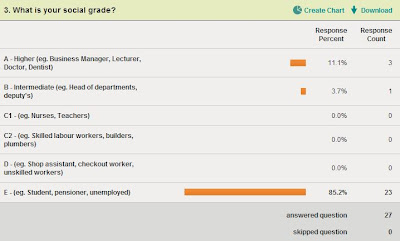
My third question was about social grades, linking to the theories I had discussed in a previous blog post. The majority of gamers that took my survey fitted into category E (Students, Pensioners or the unemployed) this was also to be expected, due to these people having the most free time on their hands.


My forth question was set to find out which social value groups my audience would most likely fit into. I had previously predicted that ‘Self Actualisers’ and ‘Disconnected’ would be the majority, this was not the case, with ‘Strivers’ and ‘Self Actualisers’ coming out top. I think the reason for this would be because, Strivers are looking for acceptance and when playing multiplayer games and being in a group like that, acceptance would be important for a player. ‘Self Actualisers’ was one of the value groups I predicted would come out highly in my questionnaire, this was the highest answer and I feel this is probably because when playing a game, exploring is often a big part, so gamers are more likely to be people who explore change enthusiastically rather than someone that would rather stick to their comfort zones.


Question five showed that the overwhelming majority of people taking my questionnaire played games at least once a day or every few days, this makes the results of my questionnaire relevant and shows I am appealing to the right target audience, under 24 year old gamers.


My sixth question shows that the majority of the gamers I questioned played games for entertainment, second to escapism. None of these people played games to ‘fit in’, only a couple played for stress relief and one played for Thrill and Excitement. This goes against my explanation, using Stanley Halls theory, on why young people play games. I will need to apply these results to my final product, making it as entertaining to my audience as possible.


When asked what their favourite genre of video game was, most chose platformer, with adventure coming in close second. I will be doing more research into genres on a future blog post, but I feel it would be best to create a platformer or adventure style game, in keeping with what my audience want. 


The majority of people that took my survey were PC gamers with 12 out of 27 choosing that option. Nintendo DS was the second most popular console with 6 people choosing it. From this, I can conclude that the majority of my target audience would prefer my game to be made for the PC, this will be something I will need to think about when it comes to planning and designing my final products. 


A large amount of people that took my survey never bought gaming magazines. A gaming magazine would be where my advertisement is most likely to be shown, but despite a lot of people not buying them, a significant amount still bought them once a month, on occasion or rarely, meaning it would still be viable to create the advertisement with a gaming magazine in mind. 


Finally, my last question asked whether people paid attention to gaming magazine and TV advertisements came out with a high majority yes, meaning that advertising in these ways would help get my game known by my audiences.

Overall, I feel my Survey Monkey has been a valuable resource when finding out what my target audience is and will hopefully help me better adhere to these people when designing and creating my final piece.

Next I will be conducting some research into already existing, iconic video game characters and do a little research into genre and what conventions I will need to be following when creating a game of a particular genre.

Sunday, 16 October 2011

Survey Monkey

Below is my Survey Monkey, It contains 10 questions that I feel will help me define a target audience, but some that will also will help me when making crucial decisions for my game such as Genre and Platform.
I posted this survey in two places I knew it'd get attention from gamers, the first being my DeviantART account and the second being my Facebook.

Above is my DeviantART post, asking for people to fill it in and below is my post on Facebook

Below is the embed for my survey, I recieved 25 responses from posting this survey in the two places I did and now I will need to analyse the results to help me attain to a target audience when producing my final product.


Create your free online surveys with SurveyMonkey, the world's leading questionnaire tool.

Monday, 10 October 2011

Target Audience Overview

Having the right target audience is a very important part of advertising a product. Making sure I am aiming my game at the right audience is something I will need to establish to ensure its success.

There are two main theories called upon in advertising. Maslow’s published paper, ‘A theory of human motivation’ which has been adapted to marketing, and theory being social grade theory.

Maslow’s theory outlined that people have a hierarchy of needs, these needs are often pinpointed by marketers who are quick to use these needs to as a means to sell their products. The five main needs, stated by Maslow are as follows – Self Actualization, Esteem, Love/Belonging, Safety and Physiological.     These needs were converted into a table of social value groups created from a study of UK values and change. The insight value group scale claims to be an accurate representation of the groups that exist in the UK today. The official insight into social value group.ltd table is shown below.


I think when it comes to gamers, the majority would fit into the disconnected or self actualisers. I think this because many gamers play games to escape reality (known as escapism) and because many other groups of gamers will play for the thrill of exploring a new place and figuring things out for themselves.
Katz and Blumler established the audience uses and gratifications theory, they claimed that audience uses media for a variety of purposes such as Diversion (Escapism), Personal Identity (self understanding), Surveillance (information retrieval) and personal relationships (conversation and companionship).
However, I do not have any evidence to support these theories, so I will be addressing social value groups in my questionnaire and finding out if I am right to aim my advertising about people in these groups.

The second theory applied to advertising is social grade theory. This theory states that depending on the social grade (correlated with earnings) is how likely they are to buy a product. For example, a student with not much time on their hands would be more likely to buy a video game than a doctor, who is working full time. I think students or those in semi skilled or manual jobs are the most likely to play video games, due to having more time on their hands.

The official social grade chart, based on social status is shown below.


Social grade will be another thing I will be researching during my audience research, this will help me test this theory and will help me better apply my product to a target audience.

Next, I will be conducting a survey, using www.Surveymonkey.com and analysing these results to see what I will need to be consider during the designing and making of my game, but also to see if these audience theories can be applied.

Tuesday, 27 September 2011

Common Conventions of the Games Industry

After analysing trailers, posters and covers. I feel I have a much better understanding of some of the common conventions seen within the game industry. Below, I will be listing several of these for each. This should be easier for when it comes to applying these conventions in the production of my final piece. 

Gaming Poster/Magazine Adverts 

  • The game’s Rating, ESRB or PEGI. This is done to inform viewers of the suitable age group for the game.
  •  Gaming platform name or logo. This identifies what the game can be played on and is used to excite players with that platform at home and encourage viewers without that system, but interested in the game, to buy one. This serves as an advertisement for both the game and the platform. 
  • Logo for the game, Iconography is commonly used for this. If the game is a sequel or part of a well known series, displaying the logo helps advertise the product and encourage older players back. If the game is new and has not had sequels or previous instalments, displaying the logo in this way helps introduce the game and shows viewers what to look for in shops.
  •  Easy to read and eye catching font that connotates to the audience the genre of the game (eg. Gothic typography for a horror game, friendly looking text for a game aimed at all ages)
  • Usually a main image of a character, or several characters recognisable or not
  •  A simple background as to not draw attention away from the main focus of the poster.
  • Most will have a screenshot or several screenshots of the game to gain attention and make people want to play.
  • Language used is emotive to make you want to play. 
 Gaming TV Trailers - 

  •  A maximum of 1 minute in length, usually around 35-40 seconds as not to be too expensive when aired on television.
  • Normally will start or end with the platform/s the game can be played on, this is done to help appeal to viewers with those consoles, as well as to inform people thinking of buying the game.
  • Non diegetic music  or soundtrack from within the game to set the theme (eg, a horror game would have spooky music whereas a more laid back game would have light hearted music)
  • Imagery or iconography from within the game is shown, often a key mechanic, type of game play or character is introduced, this works well when drawing in the audience and making them want to play, making them part of the action before even purchasing the game.
  • The logo of the game is shown at some point, this works as iconography if the game is well known and also shows viewers what to look for in shops.
  • The clips used are usually the most exciting parts in the game, this is to make it seem action packed, and encouraging people to buy it, feeling it will be worth their money.
  •  A voice over is often given, explaining the main aspects of the game and using exciting and emotive language to make the game sound interesting and fun.
Game Packaging -

  • At least one screenshot, these serve the purpose of showing a certain part of the game play, hoping to interest the viewer
  • Descriptions of the game, many interesting words are used during this, such as ‘best ever’ to make the game stand out and make people want to play it.
  • The games rating, this iconography is required by law and shows viewers what age group this game is suitable and intended for.
  • The platform the game is on, this can be shown anywhere on the games box and most will have an overlay, so the console is clearly defined.
  • Some games will use quotes or awards as a way to draw in their audience and make them think the game is something special and worth their money.
  • The logo for the game is often shown numerous times on the packaging, this form of iconography is used to make the game recognisable.
  • A large image on the front cover related to the game in some way, usually a character or a graphic showing some of the game play. This is usually not a screenshot of game play itself, rather a drawn version.
  • Copyright information, this is very small as it is not important to the viewer, however, all games have it.
  • Other forms of iconography, such as publisher or developer logo’s, seals of quality and game engine logo’s are used, these are usually on the back cover and are used to denotate to the audience information about how the game was made and who it was made by.
Now that I have established some of the common conventions of each of these aspects of a game, I will be conducting some audience research; this should help me plan my game better, with an audience in mind. I will be referring back to this conventions research when it comes to designing my final pieces.

Thursday, 22 September 2011

Game Cover Style Models

Some style models to work from when creating my game I have picked out below, these games are all similar in gernre and target audience to the game I will be creating/advertising. 


Tuesday, 20 September 2011

Cover Analysis #3 - Spyro - Enter the Dragonfly


 My final cover analysis is of the Platformer game, Spyro: Enter the dragonfly. This game was released in 2002 by Universal Studios (the one of the publishers for Spyro before Activision). The game was released for Nintendo’s Gamecube and the Playstation 2. This Spyro game was the first Spyro game to be released for generation 6 consoles and was also the first not developed by insomniac games.

The game is mainly aimed at ages 12+ and I feel that this somewhat shows in the style that this cover is done in.

The front cover of the packaging of this game features the games protagonist, Spyro. The Spyro games are a series, many games were produced before this one, and therefore it is recognisable to previous players. Much like the character Mario, Spyro acts as iconography in the gaming world, the Spyro franchise is incredibly popular. The colour scheme for this game cover consists of purples, lilacs and greys; this fits in well with the colour of his scales. This front cover features nothing much more than an extreme close up on Spyro and the Spyro logo.

The typography used on the logo is very fitting with the game. The ‘S’ has scales and a tail and the text ‘Enter the dragonfly’ is written inside a double headed dragon. This form of typography both looks interesting, but also somewhat informs the viewer about certain aspects of the game. The Spyro logo, used in other Spyro games, is also, well known and uses iconography to become recognisable to fans.

This game has 3 icons on the front cover. The ESRB rating which informs viewers that this game has been rated E – for everyone. The Universal interactive logo which detonates to the audience the publisher of the game and the official Nintendo seal of quality, something put in place by Nintendo to stop bootleg games being purchased unknowingly, this features on all of Nintendo’s products, including merchandise.

At the very top of the cover, the Nintendo Game Cube logo is shown in a curved black box, this is shown at the top of all Nintendo Game cube games and is put in place to both attract players with Game Cubes, but also to show new players what gaming platform said disk works on.

The Spine of this box art is very simple; this is done to make it easily identifiable on a shelf and not too overcrowded. This spine simply features the Spyro logo, ‘Enter the dragonfly’ in a simple red text and the Game Cube logo overlay, as seen with all Game cube games. This overlay continues on to the back cover of the game and is used to place the barcode, warning messages, icons, copyright information and more about the age rating.

The back cover, similarly to the Portal and Peggle boxes I analysed, contains screen shots. Four very different game play screenshots are shown on this box art, these are used to excite the viewer and make them want to play. Each of these screenshots has a caption below, explaining what is going on or making a statement about the game. Words like ‘Stunning’ and ‘Beautiful’ are used to entice viewers into wanting to buy the game, believing that it is going to be worth what they pay. Some of the captions refer to the viewer as ‘your’ instead of Spyro. This puts you into the place of the character and gets you involved. The use of words like ‘your’ when referring to a character, acts well as an invitation for viewers of the box to play the game.

A sub title ‘The way of the dragon. Strength, Discipline and Bubble Breath’ brings comedic value to the game, having comedy in a game is another way to light heartedly sell your product and get more people playing it.

Finally, a short paragraph is displayed on the back of the box, this, similar to a blurb on a book, briefly gives you a feel of what the game is about. It uses words like ‘Dazzling’ and phrases like ‘Hottest adventure ever’ to make viewers think they are missing out by not getting this game.

Now, after analysing 3 Posters, Trailers and Box arts, I feel I know enough about some of the common conventions used within the gaming industry. Next I will be summarising all of these, this will make it easier for me to apply these conventions to my final piece when it comes to making my product.

Wednesday, 14 September 2011

Cover Analysis #2 - Peggle Nights


The second cover art I will be analysing is the 2D puzzle game; Peggle Nights, this game was produced in 2008, distributed mainly via Steam (Digital Distribution) and was made as a sequel for 2007’s ‘Peggle’, also for the PC and distributed through Steam.
‘Peggle nights’ features game play similar to that of an arcade game and has become very popular over the years.

The first thing that hits you when you first view the cover is the colours used, unlike the Portal cover that I analysed on the previous blog post, Peggle uses a variety of bright colours to draw your eye to it, rather than using the air of mystery Portal used.

Peggle was developed and published by Popcap games, a subsidiary of Electronic Arts (A publisher/developer I have previously looked at). Their logo, which serves as iconography to players already familiar with their games, is featured on the front, back and the spine of the games package. This is done so that it can be seen whichever way the game is displayed in a shop.

The main game play of Peggle consists of the player using a ball to hit pegs placed around the screen. The game is very fast moving and has many levels to keep the player engaged; the original ‘Peggle’ game became the Action and Arcade game of the year in 2008. The box points out this to draw attention to it and make the audience believe that it would be worth their money to buy it.

The front cover features a very bright graphic, portraying a ball bouncing towards you. It is set in the night time on a city scape, this links to the name of the game, being Peggle ‘Nights’. The cover is colourful to appeal to its main target audience of 8-15 year olds and serves as a way to draw the viewer’s attention.

The Peggle logo is used throughout all the Peggle games, this features on the box to inform players of the original game that this is a sequel. The word ‘Nights’ is written underneath in a bright glowing blue joined up font, similar to neon lights you’d see at night time outside casinos in a city.

As with all commercial video games, the ESRB rating is posted in the bottom left hand corner, this is done to denotate to viewers whether the content is suitable for certain age groups. This on has the rating ‘everyone’ meaning that anyone can play it. Next to this icon is an icon showing that it is a game designed for the Mac and PC platforms. This is used to inform the viewer where this game can be played to avoid confusion.

One interesting feature of this box art is overlay of red on it. Most games, such as the one I have already analysed, will not use overlays and will just show the graphics for the box, however, some, such as this, will not. Overlays are used as a source of iconography, not many game publishers use this, but Pop cap and Sold out software are two notable examples. This is done so that gamers recognise them, often publishers using overlays will be selling the games incredibly cheaply and most gamers will have at least one game from them in their collection. Sold out software is notorious for this.

This game uses Bejewled, another incredibly popular puzzle game that received worldwide success, as a selling point, featuring ‘From the makers of Bejewled’ in the bottom right hand corner. This is intended to encourage Bejewled fans to pick up the game and give it a try.

Similar to Portal, the back of the box features both a screenshot of the game to view potential players in, but also a small summary of what the game is about. This summary goes out of its way to make the game seem exciting and fun to play, the explanation mark is used a lot.

The very bottom back of the box, in small print, shows the system requirements for the game, this is small so it doesn’t detract from the main area of focus, the screenshot, visual and other forms of text on the cover.
Below this is the copyright information, something Valve also had for Portal, this is made small due to its irrelevance to the audience it is focusing on.

The barcode is placed in the bottom right hand corner of the back of the game, this is a common place for PC games to have their bar code, unlike the unusually placed Portal barcode that went against conventions for most video games. 

Next I will be analysing one more video game cover, before going on to summarise the common conventions I have found between all the area’s I have looked at – Posters, Trailers and covers.

Saturday, 3 September 2011

Cover Analysis #1 - Portal


My first box art analysis will be for the first person puzzle game, Portal. This cover is for the original game, which was primarily released in a box set along with two other valve games, Team Fortress 2 and Half Life 2. This game was released in 2007 on the PC platform, nowadays; it is also available for purchase on Steam.
The background of the front of the box is very simple; it features a grey, slightly highlighted background, with some very faint chamber warning signs from within the game.  A simple background like this is used so that the audience’s eye is not drawn from the main logo and image. The Portal logo, the O being a blue portal itself (Iconography), is featured near the bottom of the box. Underneath this is a variety of logos, including the ESRB ratings logo that I have previously discussed. 

The ‘PC gamer editors choice’ logo is also shown, this is done to give the game more status, making people want to pick up and play it because it seems important and must be good to get a status such as that. The ‘Game developers choice awards’ logo is also displayed for the same reason as this. Portal won this award in 2008, a year after release. It was not originally given a single release this was because it was released within ‘The Orange box’ as the developers did not count on it being successful. Since then, it has won many awards and produced a sequel that is proving equally as successful. Including these logos connotates to the audience that this game is going to be a worthwhile purchase.

The Valve logo, in the right hand corner, is recognizable and acts iconography to previous players of their games. Valve is the name of the developer and publisher of Portal and is one of the companies I have researched before.

From the packaging, it is not clear what target audience the game is aimed at, the ESRB is the only clue and that is only a guideline. The ESRB rating notes that the game is suitable for teenagers, but it has many older gamers and was considered a fad at one point.

The PC CD logo, which is incredibly well recognized is shown to denotate to players what gaming platform, this game has been produced for.

Portal, as a game goes against many conventions discussed by theorists. Cumberbatch and Negrine (1992), Barnes (1992) and Longmore (1982) stated that disabled people are either screened out or in limited roles.
The representation of Chell, the character you play as during this game goes against this theory, with her being mute, a form of disability.
Mulveys theory is another theory that cannot be applied to this game, Mulvey introduced the concept of the male gaze, a theory in which, females are portrayed as objects of desire for heterosexual males in the audience. Chell, although being female, is not portrayed in this way. She is given scruffy, tied up black hair and is fully covered up by an orange jumpsuit. She is clearly not put into the game as an object of desire.

Chell’s non sexualisation has been praised by many, in particular, GamesRadar who commented "the hero of Portal just happens to be a normal-looking and normal-dressing woman, like 50% of the world's population", naming her ‘one of those mediocre game babes’.

The spine of the package also features the Portal logo, this is done for display in shops, this is done so the game can easily be noticed and picked out. The companion cube is shown above the Valve logo. This cube also acts as iconography, as it is a widely recognized element of the game, called upon when the game was going through a fad stage.

The back of the box art, once again features the companion cube. It also features a variety of screenshots from the game, making sure to show some of the main dynamics of the game, for example, traveling through space using a portal. Underneath each of these screenshots, 3 in total, there is a brief summery under each of these, explaining elements of the game play and using language to excite the reader and make them want to play.

The main screenshot on the page shows you looking down through a blue portal at some of the test chambers you will face within the game. This screenshot serves as an introduction to the Turrets, military androids within the game that you will need to solve puzzles to get around. It also shows the red Aperture science button, another key part of the game play within Portal.
The language uses a formal mode of address, simply explaining what the game is about whilst trying to draw potential players in.

Text is placed on the top left, which reads ‘Find out why the critics are raving’, this sentence both serves as an invitation to players to play the game, but also shows off the large amount of brilliant reviews the game has gained from critics.

The bottom section of the back of the box set is dedicated to the iconography of the companies and game engines that Portal runs on, along with copyright information that is made small due to its irrelevance to the games target audience. The Valve logo is once again shown here, along with the logo for Source (the engine the game runs on) and Nvidia, the graphics processor. The ESRB logo is also shown for a second time, this time noting why it has been given that rating.

Finally, the barcode is shown at the top of the box set, something that isn’t usually done for PC disks, but fits well where it has been placed.

I will be looking at two more game covers to, like with my poster deconstructions, get a better feel of the common conventions used within this type of packaging.

Sunday, 28 August 2011

Legal Affairs in the Game Industry

As with all industries, the gaming industry also has legal affairs linked with it. I have done a little research into some of these affairs, such as age ratings and the companies responsible for them.

Games will be produced with a target audience in mind (This is something I will need to think about further on in my research, once I have a clearer idea for my game). All commercial game developers and publishers will need to think about this, for example, if they are aiming their product at 12 year olds, they do not want the game to be rated higher than that, so will have to keep violent and gory themes to a minimum.

Most regions have a ratings board, for example, games released for sale in America will have been rated by ESRB (Entertainment Software Rating Board). Games to be released within Europe will be rated by PEGI (Pan European Game Information) and New Zealand and Australia have a similar system with the Office of Film and Literature Classification (OFLC) rating their games. Japan has the CERO (Computer Entertainment ratings organization) and most British games will usually be rated by PEGI, however the BBFC (British Board of Film Classification) will also occasionally rate video games. These boards are usually government funded in some way and are put in place to help parents make informed decisions on what games they are buying for their children.

The way in which these games are rated differs between rating boards, the two main boards, PEGI and ESRB choosing to use different ratings to distinguish games. Below I have shown examples of their rating systems.


Pegi rates in age categories, for example 12’s or 18’s, much like films are rated, whereas ESRB uses ratings such as ‘teen’ and ‘mature’ for theirs. These are both iconography as they are widely recognisable by gamers.


Both of these rating systems serve well as a way to deter younger gamers from violent and gory themes. This is done because young players are deemed vulnerable and easily imposed upon. The hypodermic needle theory implies that the media we see in society can have a direct and powerful effect on the audience it is viewed by, the use of powerful and positive words are often used in advertising to persuade viewers into buying a product, or thinking they need it. After the clockwork orange murder case, people are becoming more and more concerned about the effect of violent movies, books and video games on the people viewing. The games industry in particular is often criticized for making kids ‘violent’ due to the game play within them. Germany, has made the decision to ban all violent video games rated 18+, this was put in place after a school shooting. Video games are now highly regulated and Germany has its own rating board for this. I will be looking further into the effects of video games at some point, along with escapism and why people choose to play video games in the first place.

During official TV trailers, the rating is usually shown at the beginning or the end, this is done to show viewers what content deemed for a certain age group is contained within the game. Each ratings company has a variety of themes that contribute to their overall rating, for example, sexual themes, violence, substance use and violence, along with others such as gambling. The overall rating for the game is compromised of how mild, if at all, these themes are implemented into the game play.

Legal affairs associated with the advertising of the game, state that all game play or footage captured for the poster or trailer must be suitable for everyone, if shown before the watershed or in a place where under aged people may view it. If I decide to make a violent, mature rated game, this will be something I will need to keep in mind.

Another thing I will need to be keeping in mind is copyright. I will need to produce my own graphics and use my own, or royalty free music in the production of my game and my trailer.

Next I will be deconstructing the packaging of three video games, this will help me find some common conventions within them, which will be useful when designing and planning my final product.